
Liew Li Wei 0338076
Bachelor of Mass Communication (Hons) Digital Media Production
Design Principles (Minor)
Final Compilation & Reflection
INSTRUCTIONS
EXERCISE 1
Contrast
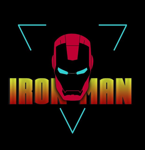
 |
| Figure 1.1: Contrast |
Gestalt Theory
 |
| Figure 1.2: Gestalt Theory (Closure) |
Rationale
- Contrast
The deer is made up of the word "DEER" and contrast is created by using the colour black and white.
- Gestalt Theory (Closure)
The closure is on the cyan triangle on the background and also the word "IRON MAN" which were partially blocked by the iron man icon.
Click here to see the whole progress of Exercise 1
EXERCISE 2
Movement
 |
| Figure 1.3: Movement |
Repetition
 |
| Figure 1.4: Repetition |
Rationale
- Movement
In this design, I created the movement of the leopard hunting the deer. It show's the different in speed of movement between a prey and predator.
- Repetition
I created the repetition design using the big cat family's claw. This design consist of the claw of Jaguar, Tiger, Cougar, Leopard, Lion and Cheetah.
Click here to see the whole progress of Exercise 2
EXERCISE 3
Symbol
 |
| Figure 1.5: Arbitrary Symbol |
Word & Image
 |
| Figure 1.6: Word & Image |
Rationale
- Symbol
This is a logo for my gaming team. We are a group of teenagers passion about game and our playstyle in fps game is quite aggressive. Therefore, I pick red as the main colour of the logo.
- Word & Image
A phase that I always tell myself while working on anything came across to my mind - aim for the sky, if you failed, at least you reached the clouds.
Click here to see the whole progress of Exercise 3
PROJECT 1: SELF PORTRAIT
 |
| Figure 1.7: Project 1: Self Portrait |
Rationale
I used a smiling photo of myself showing the cheerful side of me. Then, I overlay it with the background of Petronas Twin Towers as it symbolized my country, Malaysia and it is located at Malaysia's capital city, Kuala Lumpur.
Click here to see the whole progress of Project 1: Self Portrait
PROJECT 2: SENSE OF PLACE
 |
| Figure 1.8: Project 2: Sense of Place |
Rationale
I use the most comfortable spot in my room as my sense of place. Then I use sunset as my background as sunset give me the calm feeling that is closest to the feeling I have when I am at my computer spot.
FINAL PROJECT
STAGE 1
Selected Design
 |
| Figure 1.9: Surrealism by @imkarthik1997 in Pinterest |
Phase 1 (Observation)
This (figure 1.8) is a portrait format design work. There are multiple visual elements combined in this design. Firstly, there are multiple whales as the main visual, floating in the sky. The image feature the sun and the cloud in the sky. Then, there's a man sitting at the edge of the wooden bridge. Other than that, rock cave is used as the border for this design. The perspective of this design is from the back of the man, inside the cave. The colour used in this design is white, bright orange, light blue, dark blue and dark brown. The white indicates the cloud; bright orange indicates the sun; light and dark blue for the sky and ocean; white and blue for whales, and dark brown for the rock cave border.
Phase 2 (Analysis)
This design is approximate symmetry. The large whale in the middle, floating in the sky, is the emphasis of the image. The repetition of the whales in the sky creates movement of whales in the sky and also a sense of unity for the design. The rule of third is also applied in the design as the man locates in the middle bottom line of rule of third's line. The direction of the man looking also creates the eye movement which lead the viewer back to the big whale in the sky. Furthermore, the positive space which is the man, the whale and the rock cave; while the negative space which is the clouds and sky, is well balanced in this design. There's also proportion in the design, creating hierarchy in the design - first we see the big whale in the middle, followed by the smaller whale at the side, then the man in small size at the edge of the wooden bridge. There's also contrast between the dark rock cave border and the bright sky.
Phase 3 (Interpretation)
This a poster created by Karthik Naidu, a 3D Artist / Game Designer. He created and shared the post to the public on 22nd of May 2019. This is a surreal photography design. The technique used in this design is called multiple exposure. Multiple exposure is the superimposition of two or more exposures to create a single image, and double exposure has a corresponding meaning in respect of two images. In this design, he superimposed a man in the rock cave, the whales, the sky and the clouds into one image. The man in the cave indicates the designer himself; the whales moving freely in the sky indicates freedom. The man looking at the whale reflects that the designer's desire to freedom. Furthermore, the borderless sky shows the limitless of things that he can do as as designer. This poster is designed in a surrealistic way to show the dream scene the designer have in mind.
STAGE 2
Design
 |
| Figure 1.10: Final Project Design (Happy, Cool, Curious) |
Rationale
The main idea for this design is to illustrate myself in different emotions (happy, calm, curious, cool, open minded, relaxing). It reflects my characteristics too. People tend to know me as a happy, cool, bad-tempered and open minded person. But other than that, I am a guy who always seeks relaxation because I like being in the state of relaxation. Therefore, I used a smiling and calm face as the emphasis of the design, then I put a curious face on the left and a cool face on the right. The colour in the design is mainly pastel colour as pastel colour evoke openness and relaxations. Furthermore, the image of me sitting in different ways emphasize on the relaxation state I am in.
The main idea for this design is to illustrate myself in different emotions (happy, calm, curious, cool, open minded, relaxing). It reflects my characteristics too. People tend to know me as a happy, cool, bad-tempered and open minded person. But other than that, I am a guy who always seeks relaxation because I like being in the state of relaxation. Therefore, I used a smiling and calm face as the emphasis of the design, then I put a curious face on the left and a cool face on the right. The colour in the design is mainly pastel colour as pastel colour evoke openness and relaxations. Furthermore, the image of me sitting in different ways emphasize on the relaxation state I am in.
Click here to see the whole progress of Final Project
FINAL REFLECTION
What have I learnt in this module?
Throughout this module, I have learnt a lot about designing which I never expected since this module is just my minor. Firstly, I learnt to analysis a design piece better. I used to only know 2 words to describe an art piece - good or bad. Now, I know how to define a good and bad design through the principles I learnt, for example: emphasis, balance, harmony, repetition, etc.
What did I enjoy the most?
One thing that I enjoy the most throughout this module is the moment when I had finished the design and ready for submission. Firstly, I felt relieved for finishing my assignment. Secondly, for every design that I had done, a lot of visual research and idea exploration were needed to be done. But when I looked back, all these efforts really paid off as I were able to produce a piece that I am satisfied with.
What did I not enjoy the most?
The only thing that I did not enjoy the most is that the class is on morning. I am not really a morning person therefore I really hates morning class. Despite that, I still manage to wake up and have consultation for every single class.
What have I learnt about myself through this module?
One thing that I had learnt about myself through this module is that I get to know myself better. From the project self portrait, we are required to sketch out things about ourselves. From there, I spent some time thinking deeply about myself, what I am and what I like. If it's not for this module, I would never had done it. By doing this, I got to know and understand myself better.
What has changed and what has not in my learning journey?
The thing that I has changed in my learning journey is that the way I look at design. I used to be impressed and amazed on some design that I found online. I never really tried to study and produce a design. I thought it would be hard to produce one but it was easier than I expect. All I need is some efforts and patience in doing research. The thing that has not changed in my learning journey is my passion on designing. I know the journey wouldn't be easy, but the moment when I managed to finalize my design, it's so satisfying.
What could be improved in this module?
In my opinion, I don't think there's anything to improve in this module. For lecturer, Miss Jinchi had given effective feedback on every single design and taken the trouble to reply one by one. I really respect that. Furthermore, I really like how this module works as consultation is given to everyone fairly. Therefore, we can receive specific feedback on our own design and know what we can improve on.
Comments
Post a Comment