
24/08/2021 (Week 1)
Liew Li Wei 0338076
Bachelor of Mass Communication (Hons) Digital Media Production
Design Principles (Minor)
Exercise 1 (Gestalt Theory & Contrast)
LECTURE
Elements of Design
-
Point/Dot:
the simplest element in design.
-
Line:
a continuous mark made on a surface or the edge created
when two shapes meet. May be actual, implied, vertical, horizontal,
diagonal, and/or contour.
-
Shape/Form:
a two-dimensional element with area on a plane,
while form refers to a three-dimensional element with volume in
space.
-
Texture:
the tactile qualities of surfaces or to the visual
representation of those qualities.
-
Colour:
the visible spectrum of radiation reflected from an object. Color is
also sometimes referred to as hue.
-
Value
refers to how light or dark an object, area, or element
is, independent of its color.
-
Space:
the distance or area around or between elements in a
work.

|
|
Figure 1.1: Elements of Design
|
Principles of Design
-
Balance
The distribution of interest or visual weight in a
work. A balanced work will have all the elements arranged such that the
work will have a sense of visual equilibrium or stability. Balance can be
symmetrical, asymmetrical, or radial. Objects, values, colors, textures,
shapes, etc. can be used in creating balance in a composition.

|
|
Figure 1.2: Balance
|
-
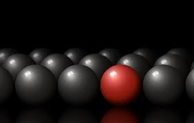
Contrast
The juxtaposition of opposing elements (opposite
colours, value light / dark, direction horizontal / vertical). The greater
the contrast, the more something will stand out and call attention to
itself.

|
|
Figure 1.3: Contrast
|
-
Emphasis
Created by visually reinforcing something we want the
viewer to pay attention to. This is often used to train the viewer’s eyes
on the center of interest, or a focal point – the area of interest the
viewer’s eye naturally, instinctively skips to. Some of the strategies
employed to create degrees of importance are contrast of values, use of
colour, placement, variation, alignment, isolation, convergence, anomaly,
proximity, size, and contrast.

|
|
Figure 1.4: Emphasis
|
-
Repetition
Strengthens a design by tying together individual
elements and bringing a sense of consistency. It can create rhythm
(regular, alternating, flowing, random, progressive) and patterns.
Variation introduced to repetition increases the level of
interest.

|
|
Figure 1.5: Repetition
|
-
Unity
Created by using harmonious similarity and repetition, continuance,
proximity, and alignment. It is the visual linking of various elements
of the work. This allows the disparate elements and principles to
create a unified whole that can be greater than the sum of its
parts.

|
|
Figure 1.6: Unity
|
-
Scale/Proportion
the sizing of elements or a standard of measurement. It can be used
in combination with other principles like emphasis to draw the viewer
into a focal point, and helps us make sense of designs or imagery. If
something is drawn to scale, it shows an object with accurate sizing
(though it could be reduced or enlarged from its actual size). This
creates a way to depict objects as larger than life, or bring a large
object down to fit on a piece of paper.

|
|
Figure 1.7: Scale/Proportion
|
-
Movement
A visual flow through the composition. In some works,
movement is implied by the use of static elements to suggest motion and
direct a viewer’s eye along a path through the work. In a still image,
aspects such as lines, diagonals, unbalanced elements, placement, and
orientation can play the role of active elements. In others, movement can
be real, giving some elements the ability to be moved or move on their
own.

|
|
Figure 1.8: Movement
|
-
Harmony
Brings together a composition with similar, related
elements (adjacent colors, similar shapes, etc.). Harmonious elements have
a logical relationship, connection, alignment, or progression. They work
together and complement each other.

|
|
Figure 1.9: Harmony
|
-
Gestalt Theory
emphasizes that the whole of anything is
greater than its parts.
-
Figure-Ground
The figure/ground principle is similar to the
closure principle in that it takes advantage of the way the brain
processes negative space.

|
|
Figure 1.10: Figure-Ground
|
-
Similarity
It’s human nature to group like things together.
In gestalt, similar elements are visually grouped, regardless of their
proximity to each other. They can be grouped by color, shape, or size.
Similarity can be used to tie together elements that might not be right
next to each other in a design.

|
|
Figure 1.11: Similarity
|
-
Proximity
Proximity refers to how close elements are to one
another. The strongest proximity relationships are those between
overlapping subjects, but just grouping objects into a single area can
also have a strong proximity effect.

|
|
Figure 1.12: Proximity
|
-
Closure
It’s the idea that your brain will fill in the
missing parts of a design or image to create a whole.

|
|
Figure 1.13: Closure
|
-
Continuity
The law of continuity posits that the human eye
will follow the smoothest path when viewing lines, regardless of how the
lines were actually drawn.

|
|
Figure 1.14: Continuity
|
-
Order
This principle says is that your brain will perceive
ambiguous shapes in as simple a manner as possible. For example, a
monochrome version of the Olympic logo is seen as a series of
overlapping circles rather than a collection of curved lines.

|
|
Figure 1.15: Order
|

|
|
Figure 1.22: Final Work
|

|
|
Figure 1.28: Attempt 3 on Closure (Wolf 2)
|

|
|
Figure 1.29: Attempt 4 on Closure (Running Cheetah)
|
After receiving feedback from Dr. Jinchi, I decided to work on my Attempt 1
(Figure 1.26), which is the Iron Man design.

|
|
Figure 1.30: Final Work
|
FINAL OUTCOME
Contrast
|
| Figure 1.31: Final Work for Contrast |
Gestalt Theory (Closure)
|
| Figure 1.32: Final Work for Gestalt Theory (Closure) |
FEEDBACK
After receiving feedback from Dr. Jinchi on week 3, my attempt on the Iron
Man for Gestalt Theory (Closure) can be kept and work on. Miss suggested
that I could play around with the font too. As for the attempt on wolf and
leopard for Gestalt Theory, the design ideas is too common, therefore it
is better to take it as idea exploration. For contrast, miss said I have
good understanding on contrast as she can see through the photo I took but
I needed to design on my own instead of taking photos as this is a
designing class, therefore I will need to create a new design for it.
REFLECTION
For this module, I realized that tons of research must be done in order to
gasp a better understanding of each topic. Although the videos sent by Miss
Jinchi is actually sufficient enough for me as the explanation in the video is
clear , yet research must still be made for ideas exploration.


Comments
Post a Comment