2/11/2021 - 23/11/2021 (Week 11-14)
Liew Li Wei 0338076
Bachelor of Mass Communication (Hons) Digital Media Production
Design Principles (Minor)
Final Project: Visual Analysis
LECTURE
Visual Analysis
-
Is a method of understanding design that focuses on the visual elements
and principles.
-
In its strictest definition -a description and explanation of visual
structure for its own sake.
-
Visual analysis is a critical part of visual literacy, a skill that helps
people read and critically interpret images, whether in a museum, on
social media, in entertainment, advertising, or the news.
-
Practicing visual analysis sharpens critical judgment skills and helps
people seek out answers instead of passively receiving information.
How does visual analysis work?
- Phase 1: Observation
-
Observation means closely looking at and identifying the visual elements
of a design, trying to describe them carefully and accurately in your
own words. Do not read beforehand about the design at all.
-
The observation phase is about looking, thinking, and finding good
language to communicate what you notice.
- Phase 2: Analysis
-
Analysis requires you to think about your observations and try to make
statements about the work based on the evidence of your observations.
-
Think about how the specific visual elements that you’ve identified
combine together to create a whole, and what effect that whole has on
the viewer.
-
How your eye isled through the work and why? Apply the Design Principles
knowledge you have learnt throughout these weeks.
- Phase 3: Interpretation
-
In this final phase, your observations, description, and analysis of the
work are fused with facts about the design work (and in some cases the
designer) and historical context that you find in trustworthy published
sources.
-
What is the meaning of the design? What was the purpose for it to be
created?
FINAL PROJECT: VISUAL ANALYSIS
STAGE 1
Visual Research

|
|
Figure 1.1: Design by Magdiel Lopez
|

|
|
Figure 1.2: Design by Magdiel Lopez
|

|
|
Figure 1.3: Design from designwizard.com
|

|
|
Figure 1.4: Design from Freepik
|

|
|
Figure 1.5: Design from Pinterest
|

|
|
Figure 1.6: Design from Pinterest
|

|
|
Figure 1.7: Design from Pinterest
|
Selected Design

|
|
Figure 1.8: Surrealism by @imkarthik1997 in Pinterest
|
Phase 1 (Observation)
This (figure 1.8) is a portrait format design work. There are multiple
visual elements combined in this design. Firstly, there are multiple whales
as the main visual, floating in the sky. The image feature the sun and the
cloud in the sky. Then, there's a man sitting at the edge of the wooden
bridge. Other than that, rock cave is used as the border for this design.
The perspective of this design is from the back of the man, inside the cave.
The colour used in this design is white, bright orange, light blue, dark
blue and dark brown. The white indicates the cloud; bright orange indicates
the sun; light and dark blue for the sky and ocean; white and blue for
whales, and dark brown for the rock cave border.
Phase 2 (Analysis)
This design is approximate symmetry. The large whale in the middle, floating
in the sky, is the emphasis of the image. The repetition of the whales in
the sky creates movement of whales in the sky and also a sense of unity for
the design. The rule of third is also applied in the design as the man
locates in the middle bottom line of rule of third's line. The direction of
the man looking also creates the eye movement which lead the viewer back to
the big whale in the sky. Furthermore, the positive space which is the man,
the whale and the rock cave; while the negative space which is the clouds
and sky, is well balanced in this design. There's also proportion in the
design, creating hierarchy in the design - first we see the big whale in the
middle, followed by the smaller whale at the side, then the man in small
size at the edge of the wooden bridge. There's also contrast between the
dark rock cave border and the bright sky.
Phase 3 (Interpretation)
This a poster created by Karthik Naidu, a 3D Artist / Game Designer. He
created and shared the post to the public on 22nd of May 2019. This is a
surreal photography design. The technique used in this design is called
multiple exposure. Multiple exposure is the superimposition of two or more
exposures to create a single image, and double exposure has a corresponding
meaning in respect of two images. In this design, he superimposed a man in
the rock cave, the whales, the sky and the clouds into one image. The man in
the cave indicates the designer himself; the whales moving freely in the sky
indicates freedom. The man looking at the whale reflects that the designer's
desire to freedom. Furthermore, the borderless sky shows the limitless of
things that he can do as as designer. This poster is designed in a
surrealistic way to show the dream scene the designer have in mind.
STAGE 2
Design Idea
From the stage 1's visual analysis, I chose a surrealism design by @imkarthik1997.
I am amazed by his design. I like his style of using the multiple exposure
technique in creating a surrealism design and I am inspired by it.
Therefore, I decided to create a surrealism design using the multiple
exposure technique.
Visual Research

|
|
Figure 1.9: Surrealism Photography by TechRadar
|

|
|
Figure 1.10: Surrealism Photography by Austin Greene
|

|
|
Figure 1.11: Surrealism Photography from Pinterest
|

|
Figure 1.12: Surrealism Photography by @mawj162
|
Idea Exploration
In this design, I wanted to illustrate my peaceful inner feelings. The first
thing I think about peaceful is nature. I always have the calm and peaceful
mind whenever I am in nature. No technology disturbance, no noise pollution,
no light pollution. Everything is so original and pure.
From my visual research, I had found some surrealism photography in blending
human and nature by using double exposure technique. Therefore, I wanted to
try on blending myself with the nature using the double exposure technique.
The nature that I will be using is Pine Tree Forest.

|
|
Figure 1.13: A photo of myself
|

|
|
Figure 1.14: Pine Tree Forest from NiO Photography
|

|
|
Figure 1.15: Design 1 (Colour Type 1)
|

|
|
Figure 1.16: Design 1 (Colour Type 2)
|
After receiving feedback from Miss Jinchi, I decided to illustrate my daily
emotion in this design by using multiple exposure technique. I will be using
a few photos of mine. All these photos will have different angles and my
different daily face expression.

|
|
Figure 1.17: Curious Face of Me
|

|
|
Figure 1.18: Happy Face of Me
|

|
|
Figure 1.19: Cool Face of Me
|

|
|
Figure 1.20: Mad Face of Me
|

|
|
Figure 1.21: Happy Face of Me 2
|

|
|
Figure 1.22: Design 2.1 (Happy, Cool, Curious)
|

|
|
Figure 1.23: Design 2.2 (Happy, Cool, Mad)
|
|
Figure 1.24: Design 2.1 (Happy, Cool, Curious)
|
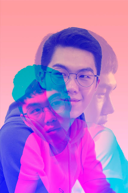
FINAL OUTCOME
|
|
|
Figure 1.25: Final Submission for Final Project
|
Rationale
The main idea for this design is to illustrate myself in different emotions
(happy, calm, curious, cool, open minded, relaxing). It reflects my
characteristics too. People tend to know me as a happy, cool, bad-tempered and
open minded person. But other than that, I am a guy who always seeks
relaxation because I like being in the state of relaxation. Therefore, I used
a smiling and calm face as the emphasis of the design, then I put a curious
face on the left and a cool face on the right. The colour in the design is
mainly pastel colour as pastel colour evoke openness and relaxations.
Furthermore, the image of me sitting in different ways emphasize on the
relaxation state I am in.
FEEDBACK
Overall feedback for my past work:
Hi Li Wei, for Design Principles, here’s the overall feedback for your:
Exercises: The student shows some understanding of design principles and
is able to create designs that reflect the principles. The blog has the
basic required items.
Project 1 The final outcome expresses the intended message, with suitable
design principles applied.
Project 2: Applied design principles knowledge, able to communicate the
intended message. Has some exploration done.
Specific Feedback for this project:
Miss Jinchi suggested me to work on a more creative idea instead of blending
myself with nature as it is similar to the idea of the my visual research.
Miss suggested me to try on blending my own photo with different angles
using the multiple exposure technique.
REFLECTION
I have some difficulties in generating idea for this project. Yet, with Miss
Jinchi's guidance, I managed to come up with a final design that I am
satisfied with.

Comments
Post a Comment