27/08/2021 - 24/09/2021 (Week 1-5)
Liew Li Wei 0338076
Bachelor of Mass Communication (Hons) Digital Media Production
Illustration & Visual Narrative (Minor)
Task 1: Exercises
LECTURES
Week 1
We were welcomed by Miss Anis and Miss Jennifer. As it is the first class for
the module, Miss Anis explained on the MIB so that we know what we will be
facing for the upcoming weeks. It was a really chill session , yet I am already
excited for what I will be doing for the upcoming weeks.
Week 2
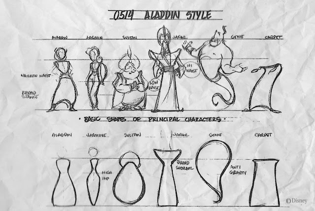
Character Design Basics
Like all design, character design follows a set of principles:
-
Shapes
Shapes define a character's silhouette! It is used to identify
a character from one another. This is what sets the iconic look.
|
|
Figure 2.1: Example of Shapes in Character Design
|
-
Colour
Colours play an important role at determining who are the
heroes/protagonists or villains/antagonists. Different choices of colours
also give an impression on a character. Colours have qualities that can
cause certain emotions on people.

|
|
Figure 2.2: Example of Colour in Character Design
|
-
Emphasis & Contrast
A good character design is when you pick one
visual element in a character and exaggerate it, making the character
outstanding and memorable. Sometimes picking a cultural element and adding
it to a design makes it uniquely authentic, like Disney's Hercules for
example.

|
|
Figure 2.3: Example of Emphasis & Contrast in Character
Design
|
-
Harmony
All shapes, line, colours, motifs, patterns must be put
together in a tasteful manner. Every element used in your design must work
together like they compliment each other - A balance visual elements that
has visual heirarchy.

|
|
Figure 2.4: Example of Harmony in Character Design
|
-
Expressions/Poses
The character's behaviour/quirks/personalities that
are visual shown, is what makes your characters win the heart of
audiences. You don't need to tell them, your audiences can interpret
them!

|
|
Figure 2.5: Example of Expressions/Poses in Character Design
|
Week 3
Composition 1
-
Type of shots/Composition:

|
|
Figure 3.1: Type of shots / Composition
|
- Composition Rule No.1:
-
a balanced distribution of POSITIVE vs NEGATIVE spaces
- find a balance of positive & negative spaces
- visual hierarchy
- mood,
- rhythm/movement
- visual elements that tell/stage a story
-
there's no right or wrong in composition, only
bad & tasteful composition

|
|
Figure 3.2: Positive vs Negative Spaces Example 1
|

|
|
Figure 3.3: Positive vs Negative Spaces Example 2
|

|
|
Figure 3.4: Positive vs Negative Spaces Example 3
|
Week 4
Composition 2
We were introduced to the paintings of Maverik, Da Vinci and Raphael. We
learnt about how they make use of linear perspective in their paintings, but
what is Perspective?
Perspective:
- to create depth
- an illusion
-
a representation of objects
(from 2D surface to create a 3D
optical illusion)
- type of perspectives
- 1 point
- 2 point
- 3 point
- 4-5 points (fisheye)
- number of points = number of vanishing points

|
|
Figure 4.1: Maverick's work
|

|
|
Figure 4.2: Da Vinci's work
|

|
|
Figure 4.3: Raphael's work
|
Week 5
Composition 3
In this week, we studied about rhythm & movement. Having rhythm in art is one of the most difficult aspect to achieve.
Basic visual elements (tools) to create movement:
 |
| Figure 5.1: Maximizing Overlaps |
 |
| Figure 5.2: Establish Patterns & Rhythms |
"Good artists imitate, great artists steal" - Pablo Picasso
 |
| Figure 5.3: Painting by Suraj Finearts |
 |
| Figure 5.4: The movement of the painting |
 |
| Figure 5.5: Painting by Suraj Finearts 2 |
 |
| Figure 5.6: Creating rhythm using different size of negative space |
 |
| Figure 5.7: Demonstrating main subject / focal point in the painting |
INSTRUCTIONS
EXERCISE 1 - Vormator Challenge
For this task, we are required to create a character of our own using a set
of shapes given. We are allowed to rotate, flip and duplicate the shapes. We
can also add, subtract, intersect and group elements. What we cant do is
alter the original shapes. This is quite challenging for me, but I like
facing challenge. Therefore I am ready to face the difficulty in this
design.

|
|
Figure 5.1: Vormator Elements
|
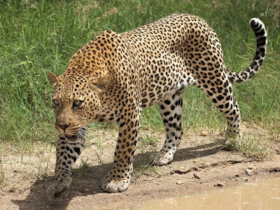
I was inspired by the barbarian and leopard image. Then, I create a
character with the combination of both.

|
|
Figure 5.2: Barbarian Warrior
|
|
|
Figure 5.3: Leopard
|
I combined all the shape and have a outline of the character

|
|
Figure 5.4: Character Outline
|
Then I started to fill in colour with gradient tool and also create the
stripe of the leopard on the character's body using the given shape. I
also created the muscle lining on the body. Then, I created my final
design for my Task 1. I named it Leoprior, which is the short form of
Leopard Warrior.

|
|
Figure 5.5: Final Design
|
EXERCISE 2 - Vector Illustration
For exercise 2, we will use our exercise 1's character to create a game
card layout. We will design the front and back of the card.
For the card, I added texture of forest for the background of the front
and back card. Then I added an double axe image on the back of the card.

|
|
Figure 6.1: Forest Texture
|

|
|
Figure 6.2: Double Axe
|

|
|
Figure 6.3: Front Card Design
|

|
|
Figure 6.4: Back Card Design
|
After receiving feedback from Miss Jennifer, I added the rock texture
onto the back card's image and words. I also add texture to the number
on the front card.

|
|
Figure 6.5: Rock Texture
|

|
|
Figure 6.6: Front Card Final Design
|
|

|
|
Figure 6.7: Back Card Final Design
|
|

|
|
Figure 6.8: Character Card Final Design
|
FEEDBACKS
Week 2
Miss Anis commented on my character design that it is too simple, I
should explore more.
Week 3
Miss Anis approved my design and suggested me to add more gradient to
the character to show the muscle of my character.
Week 4
Miss Anis and Miss Jennifer suggested some changes for my background so
that the card wouldn't be too dull and boring.
Week 5
Miss Jennifer suggested that I can add rock texture to my text and image so that it will be better for visual.
REFLECTION
This is my first time creating a character and player card of my own. For the past I was playing card all the time and I can't really imagine I am creating my own play card now. It is exciting and challenging for me and yet I finally managed to do it. My design might not be the best one but I am really grateful and proud of my own play card. I wanted to thank Miss Anis and Miss Jennifer for the giving me the opportunity to do it.


Comments
Post a Comment