
Liew Li Wei 0338076
Bachelor of Mass Communication (Hons) Digital Media Production
Typography (Minor)
Task (Exercise/Project)
LECTURES
Week 1: Introduction
Typography is the creation of typefaces. Typography is also an animation which
can come in animated forms like GIF. Typography is also visible and prevalent
in website designs as it will influence the design of the websites. Therefore
in order to create good websites, you need to have good typography. Nowadays,
typography plays an important role on apps as typography enable the apps to be
more appealing to the users and also let the apps communicate what it's
suppose to communicate with the users through the interface of the apps. In
the lesson, Mr. Vinod talked about the terminological reference between font
and typeface. Font refers to the individual font or weight within the
typeface, for example: Georgia Regular, Georgia Italic, and Georgia Bold;
typeface refers to the various families that do not share characteristics, for
example Georgia, Arial, Times New Roman, etc.

|
|
Figure 1: Typeface vs Font
|
Week 2: Development/Timeline of Typography
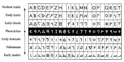
Early letterform development: Phoenician to Roman
Writing was meant scratching into wet clay with tools like sharpened stick or
carving into stone with a chisel. At that time, writing was just combination
of straight lines and circles as their tools limit them to do more. Therefore,
we can learn that the tools we hold in our hands played an important role in
typography as different tools we use might create a different type of
typefaces.
|
| Figure 2.1: Evolution of letters |
Initially, Phoenicians wrote from right to left. The Greeks then developed a
style known as 'boustrophedon'. The text was then read alternately from right
to left and left to right. As the direction changed, the orientation of
letterforms changed too.

|
| Figure 2.2: Boustrophedon |
Hand script from 3rd-10th century C.E.
Square capitals with serifs added to the finish of the main strokes can be
found in Roman monuments. These strokes width was achieved by the reed pen
held at an angle of approximately 60° off the perpendicular.

|
| Figure 2.3: Square Capitals (4th - 5th century) |
Then, a compressed version of square capitals was formed, which was known as
'rustic capitals'. Although rustic capitals are faster and easier to write,
yet they are harder to read due to their compressed nature.

|
| Figure 2.4: Rustic Capitals (Late 3rd - mid 4th century) |
Instead of square and rustic capitals, cursive hand which forms were
simplified for speed, are used in everyday transactions. This is also where
the beginning of lowercase forms.

|
| Figure 2.5: Roman cursive hand (4th century) |
Uncials incorporated some aspects of the Roman cursive hand. The broad forms
of uncials are more readable at small sized than rustic capitals. Uncial can
be think as small letters.

|
| Figure 2.6: Uncial (4th - 5th century) |
Half-uncials mark the formal beginning of lowercase letterforms, replete with
ascenders and descenders, 2000 years after the origin of the Phoenician
alphabet.

|
|
Figure 2.7: Half-uncial (C. 500) |
Blackletter to Gutenberg's Type
In northern Europe, Blackletter and texture gained popularity; in the south, rotunda gained popularity. Gutenberg mimicked the Blackletter of Northern Europe while building pages. His type mold required a different brass matrix, or negative impression, for each letterform.Text type classification:
- 1450 - Blackletter (Eg: Cloister Black, Goudy Text)
- 1475 - Oldstyle (Eg: Bembo, Caslon, Janson)
- 1500 - Italic
- 1550 - Script (Eg: Mistral, Kuenstler Script)
- 1750 - Transitional (Eg: Baskerville, Century, Time Roman)
- 1775 - Modern (Eg: Bodoni, Bell, Didot)
- 1825 - Square Serif/Slab Serif (Eg: Serifa, Clarendon, Rockwell)
- 1900 - San Serif (Eg: Gill Sans, Futura, Helvetica, Trade Gothic)
- 1990 - Serif/San Serif (Eg: Rotis,Scala, Stone)
Week 3: Basics in Typography
Describing Letterform

|
| Figure 3.1: Glossary of terms |
- Baseline - the imaginary line the visual base of the letterforms
- Median - the imaginary line defining the x-height of letterforms
- X-height - the height in any typeface of the lowercase 'x'
- Stroke - any line that defines the basic letterform
- Apex/Vertex - intersection of 2 lines/strokes (apex highest vertex lowest)
- Arm - short stokes from the letterform's stem, either horizontally (E, F, L) or upwardly (K, Y)
- Ascender - line that exceed the median line
- Descender - line below the baseline
- Barb - the half-serif finish on some curved stroke
- Beak - the half-serif finish on some horizontal arms
- Bowl - the rounded form that describes a counter (may be closed or open)
- Bracket - the transition between serif and the stem
- Cross Bar - the horizontal stroke in a letterform that joins two stems together (middle line of A)
- Cross Stroke - the horizontal stroke that joins two stems together (middle of f/t)
- Crotch - the interior space where two strokes meet
- Ear - the stroke extending out from the main steam or body of the letterform
- Em/en - the width of an uppercase M/n
- Finial - the rounder non-serif terminal to a stroke
- Ligature - character formed by the combination of two or more letterforms (fi/fl)
- Link - the stroke that connects the bowl and the loop of lowercase G
- Loop - the bowl created in the descender of the lowercase G
- Serif - the right-angled or oblique foot at the end of the stroke
- Shoulder - curved stroke that is not part of a bowl
- Spine - the curved stem of the S
- Spur - extension the articulates the junction of the curved and rectilinear stroke
- Stem - the significant vertical or oblique stroke
- Stress - indicated by the thin stroke in round forms
- Swash - the flourish expands the letterform's stroke
- Tail - the curved diagonal stroke that appears at the end of certain letterforms
- Terminal - a stroke without a serif's self-contained finish
The Font
- Uppercase - A
- Lowercase - a
- Small Capitals - Uppercase letterforms draw to the x-height of the typeface
- Uppercase Numerals - numbers with the size of uppercase letter
- Lowercase Numerals - numbers with the size of lowercase letter
- Italic/Roman - a/a
- Punctuation, miscellaneous characters
- Ornaments
Describing Typefaces

|
| Figure 3.2: Describing Typefaces |
Comparing Typefaces

|
| Figure 3.3: Comparing typefaces |
Week 4: Text/Tracking
Command in Adobe InDesign
- Ctrl + A - select all text
- Ctrl + Shift + >/< - increase/decrease the size of the word
- Ctrl + Shift +Alt + >/< - increase/decrese the size of the word with higher speed
- Ctrl + " - turn on/off column's margin
- Alt + Left/Right arrow - increase/decrease the amount of space between letters
Kerning and Letterspacing
- Kerning - the adjustments of space between characters
- Letterspacing - adjustment of space uniformly over a range of characters (not more than 3 times)
- Tracking - the adjustments of space between groups of characters (kerning+letterspacing) (5)
Formatting Text
- Flush left / Ragged right (left align)
- Centered / Ragged right and left (center align)
- Flush right / Ragged left (right align)
- Justified
Leading and Line Length
- Type size
- Leading - distance between lines (2-2.5 points larger than the text size)
- Line length (55-65 characters)
Indicating Paragraphs
- Pilcrow (¶) - used in text to indicate paragraph spacing
- Line spacing
- distance between descenders of one line to another
- must be same as leading in order to maintain the cross-alignment
- e.g. text size 10, leading 12, line spacing 12
- Indentation
- same size as line spacing
- never use it with left alignment as it will produce left and right ragging
- best use with justified
- Extended paragraphs

|
| Figure 4.1: Leading vs Line Spacing |
Widows and Orphans
- Widow - a short line of type left alone at the end of a column
- Orphan - a short line of type left alone at the start of new column
- Force line break can be used to avoid widows or smoothens your ragging

|
| Figure 4.2: Orphan vs Widow |
Highlighting Text
- Italic
- Bold
- Changing colour of the text (black, cyan, magenta)
- Changing typeface from the same family
- reduce the font size by 0.5 if you are changing from serif to sans-serif typefaces because sans-serif tends to look larger
- reduce the number's font size by 0.5 if they stick out
- Create a box around the text
Headline within Text
- A head - indicate a clear break between the topics
- set larger than text
- small caps
- bold
- extended outside but in line with the body of text
- B head - indicate a new supporting argument (subordinate to A heads)
- small caps
- italic
- bold serif
- bold san serif
- C head - highlights specific facets of material within B head text (not common)
- small caps
- italic
- bold serif
- bold san-serif
Cross Alignment
Cross aligning headlines and captions with text type reinforces the
architectural sense of the page.
Week 5: Letters
Understanding Letterforms
- Uppercase letterforms suggest symmetry, but it is not symmetrical.
- There are difference in stroke weight and slope width.

|
| Figure 5.1: Baskerville and Univers |
Maintaining x-height
- All letters that are curved will exceed the median line and base line a little
- This is due to curved letters tend to look smaller and they have lesser area touched on the median line and base line

|
| Figure 5.2: Example of letters with curved stroke |
Form / Counterform
- Form - spaces obtained by the stroke
- Counterform - spaces obtain outside the stroke

|
| Figure 5.3: Form and Counterform |
Contrast

|
| Figure 5.4: Example of contrast |
INSTRUCTIONS
<iframe
src="https://drive.google.com/file/d/1ZzHul3iOSlaX8cGeRlwR4be6neCvEoFW/preview"
width="640" height="480"></iframe>
Task 1
Type Expression

|
| Figure 1.1: Spin Animation |

|
| Figure 1.2: Type Expression Final Outcome |
<iframe src="https://drive.google.com/file/d/1lQjMv66X-We6hIm65w7QIKyTnXeBgxQ-/preview" width="640" height="480"></iframe>
Text Formatting

|
| Figure 1.3: My Name |

|
| Figure 1.4: Text Formatting Final Outcome |
<iframe src="https://drive.google.com/file/d/1DL8CyYx9Sp2Pqla8MsU4TSZWwYq9lkv3/preview" width="640" height="480"></iframe>
FEEDBACKS
Week 1-4:
(no feedbacks as I only took the module from week 5 onwards)
Week 5:
General Feedback:
Cross alignment, ragging, rivers, widow and orphan. All these elements are basic yet the most important in producing good typography, therefore we need to pay more attention on these elements before we proceed to a more advanced part.
Cross alignment, ragging, rivers, widow and orphan. All these elements are basic yet the most important in producing good typography, therefore we need to pay more attention on these elements before we proceed to a more advanced part.
Specific Feedback:
As it is my first class of the module, I have no work shown to the lecturer, therefore I did not receive any feedback regarding my work. I was asked to watched lecture videos and catch up with the task.
REFLECTIONS
Week 1-4:
(no experience, observations or findings as I only took the module from week
5 onwards)
Week 5:
Experience:
As it is my first class, I get to know who my classmates are and how the class flow. During breakout discussion, I was able to communicate with give my personal opinions on my classmates' work.
Observations:
As it is my first class, I get to know who my classmates are and how the class flow. During breakout discussion, I was able to communicate with give my personal opinions on my classmates' work.
Observations:
All the classmates I had communicated are friendly and willing to help me with catching up my work. I can notice their art sense and their creativity through their work, which really amazed me as everyone has their style of designing in typography.
Findings:
Findings:
FUTHER READINGS

This book covers what I'd typically need many for. It has all the essential content for a basic type course while offering a wealth of information for advanced learners. It is rich in history and spans many cultures and alphabets. I can connect with the subject and gain contextual awareness through case studies, examples, and exercises with well-structured methods. I'm thrilled to find comprehensive information on optical, technical, and ethical dimensions all in one place.

Comments
Post a Comment